
I joined Teradata in 2008.
At the time, inside the organization, the idea of using a data federation solution to run analytics workloads at scale, instead of a traditional ETL/ELT approach, was considered at best extravagant and in most cases plainly nonsensical.
With the arrival of Hadoop this attitude changed because a lot of organization felt IT finally had found the philosopher’s stone of analytics and suddenly the demand to merge the best of the old (database) and new world (Hadoop) soared.
In this context in 2015 I ran my first benchmark of a data federation solution at scale thanks to the recently introduced product called Teradata QueryGrid.
The setup included a Teradata database cluster, an Hadoop cluster, and an Oracle database.
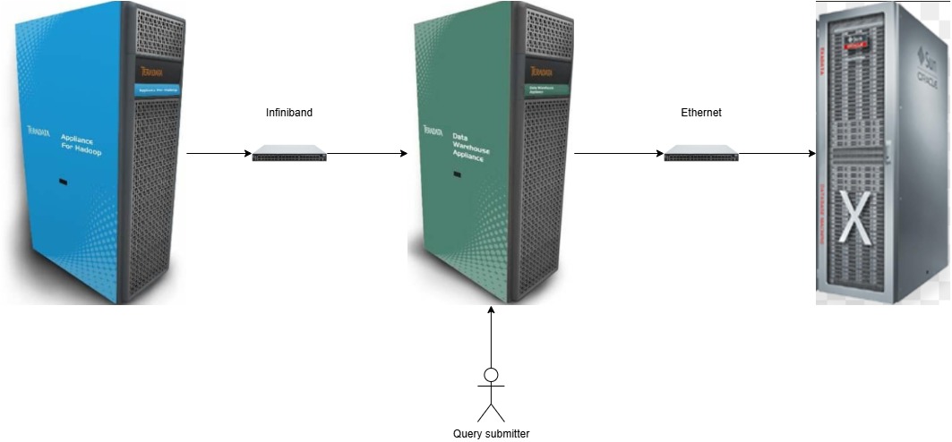
With Teradata and Hadoop nodes connected over an Infiniband network it felt like nothing could stop me from sailing smoothly through the test workloads.
The feeling lasted just until I started to go beyond the functional tests.
With one of the client-provided queries retrieving 300,000,000 (three hundred millions) rows from Hadoop (for each execution) the account team and I quickly became aware of the scalability limits we faced even when working with an infrastructure that was undoubtedly top notch.
The volume of data that needed to be moved was not the only dimension that was pushing the limit of the architecture, but it was the most important of all.
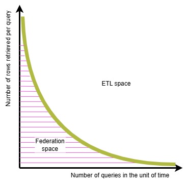
This reality of querying distributed data sets is schematically summarized in the diagram below: the volume of data that needs to be moved can make a distributed architecture not viable.
I didn’t come up with this diagram until 2020: at the time I was in a meeting with my team mates in the AWS ASEAN analytics specialist solution architects (at the time lead by Raja) and we were discussing, among the other topic the recent announcement of Google’s BigQuery Omni running on Anthos.
There was a some concern among the colleagues that the new offering from Google might be a game changer and put us in a difficult spot.
I drafted the diagram to help us all put the announcement in the context of it intrinsic limits.
We were much more relaxed after using it to frame our reasoning.
The diagram above comes without unit of measure on the axis on purpose for two main reasons:
– each organization has a different technology landscape (source systems and interconnects) with different sustainable throughput and this would change the numbers
– the acceptable query response latency moves, ceteris paribus, the yellow curve closer or farther away from the X and Y axis
The careful reader will notice I haven’t mentioned commonly considered techniques to help reduce the load on the interconnection.
I’ll write about data caching and query push down in the next post.
